monUnique Beginners Guide
1.0 monUnique App Overview
monUniqueTM is a new company that offers an iPhone App, that will allow users to easily create multiple designs from a particular image. Android version of the app is currently in development. A user can click or select a photograph and apply one or more design filters to the photograph to create multiple Scalable Vector Graphics (SVG) based designs consisting of multiple design objects of varied shapes and textures. In future the app will open up the API for any user to add Design Filters and Textures. The app consists of the following three modules:
-
Photo Selection Module
-
View Design Module
-
Edit Design Module
2.0 Photo Selection Module
As you can see, there are 3 modules towards the bottom. The first tab is for this very opening view of Photo Selection. The second tab is for “View Design” and the third tab is for “Edit Design”, both of which are disabled in the beginning and will only be enabled when a photo has been captured or selected. Let’s talk about the Photo Selection View. There are two buttons presented towards the lower half of the screen as part of segment control: 1) Photo Capture (Camera Icon) and 2) Photo Selection (Folder icon). Towards the very bottom of the view is Tab control buttons. The first tab is for this very opening view of Photo Selection. The second tab is for “View Design” and the third tab is for “Edit Design”, both of which are disabled in the beginning and will only be enabled when a photo has been captured or selected.
There are 2 pages in the Photo Selection Module. The first page is displayed when the app opens up. This page is for selecting a Photo to generate design textures. There is a small page control widget below the segment controls which indicates there are 2 pages. The second page can be accessed by swiping left or by clicking on page control. The second page is for selecting a Selfie, Portrait or any Image you would want to overlay in a design object.
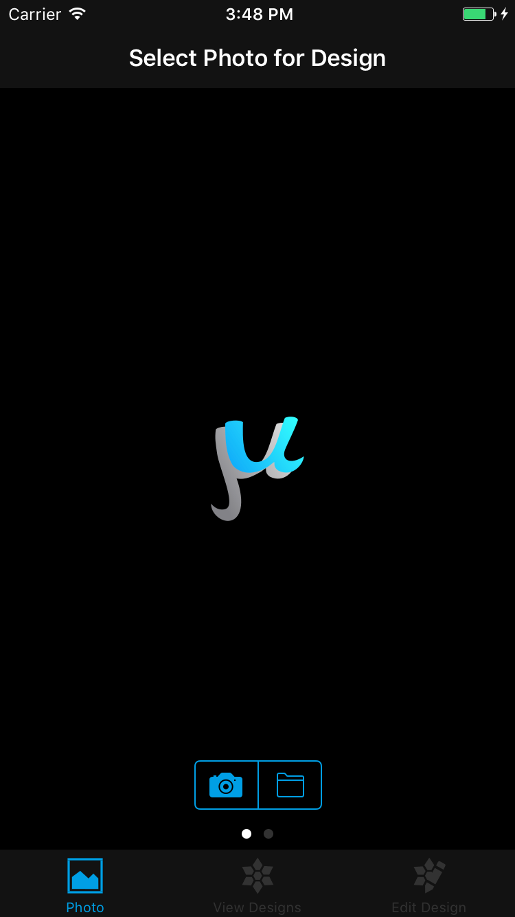
2.1 Select Photo for Design
This page is for selecting an image which will act as a seed to generate different design textures for varied design objects.
2.1.1 Photo Capture
When the Camera Icon is touched the iOS Camera module is invoked and you can click the photo. When you are done, the photo is displayed in the Photo Select view. Also now both the “View Designs” and “Edit Design” tabs have been enabled. If the photo is captured horizontally (in landscape orientation) the photo is rotated and shown in vertical orientation to fill the full portrait view. This avoids having blank space and allows the user to touch the photo at any point in the portrait view and generate design texture.
2.1.2 Photo Selection
When the “Folder” Icon is touched the iOS Photo module is invoked you can select any photo from your camera roll/moments etc. When you’re done, the photo is displayed in the Photo Select view. Also both the “View Design” and “Edit Design” tab is enabled. If the photo is horizontal (in landscape orientation) the photo is rotated and shown in vertical orientation to fill the full portrait view. This avoids having blank space and allows the user to touch the photo at any point in the portrait view and generate design texture.
 |
 |
| Fig 2.1: Opening View - Photo Selection | Fig 2.2: After Photo Capture/Selection |

Fig 2.3: Photo Orientation changed
2.2 Selfie / Overlay Image
This page is for either clicking a Selfie, take a portrait or use any image which will be overlaid on the design object just by itself or with a texture. The same photo capture and selection buttons are available in this view also. Figure 2.4 shows a portrait image selected in this page. There is a built in portrait filter which works well with this overlay image. Each and every design object can overlay the portrait/selfie on the design but it is not available by default. For the rest of the design objects, the user has to go in edit mode and switch on Overlay in the Design Preferences.
 |
 |
| Fig 2.4: Selfie / Overlay Image | Fig 2.5 Portrait Filter - Framed Mirror |
3.0 View Design Module
In this view all the design objects and designs of a selected filter can be viewed. By default the “Dance” filter is selected the first time this view is presented. The first design object displayed is “Ballet Dancer”. The texture used in this design object is “Radial”. The default mode when the view is displayed for the first time is “Single”. In this mode the user can swipe left or right to view the design objects in the filter. As the user touches the different parts of the view the texture within the design changes by picking a different area of the photo and regenerate the texture as shown in the figure below.
This view has a navigation bar on the top. On the left is “Photo”, when touched takes the user to Photo Selection View. On the right is “Edit”, when touched takes the user to “Design Edit” view. On the very bottom is the Tab Bar. When the "Photo" tab is touched the user is taken to the Photo Selection View. When the "Edit Design" tab is touched the user is take to the "Design Edit" view.
 |
 |
| Fig 3.1 View Design - Change Design Object Texture | |
3.1 Design Modes
There are 3 design view modes available in the “View Design” module which can be navigated by touching different segments of the segment control . The three modes are: Single, Multiple and Mixed.
3.1.1 Single Mode
The “Single” mode is the default mode. In this mode the user has the ability to view all the Design Objects or shapes in the Design Filter by swiping left and right. Only the left and right swipe is available in Single Mode. In this mode only a single design object will be shown at a time. The user can swipe left to go to the next Design Object or Shape in the filter and swipe right to go to the previous one.
 |
 |
 |
| Fig 3.2 - Single Mode - Swipe left or right to change the Design Object or Shape. | ||
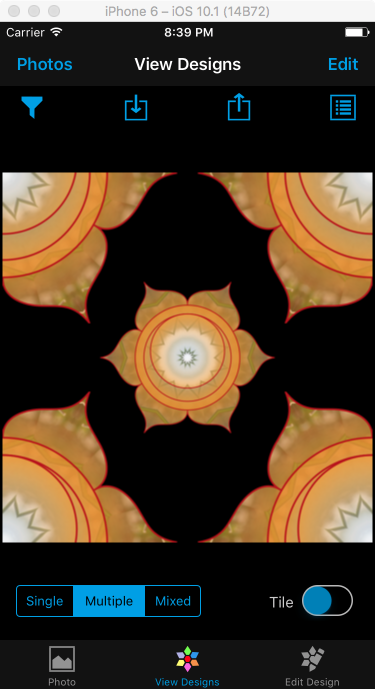
3.1.2 Multiple Mode
The multiple mode is selected by touching the "Multiple" button in the segment control. The multiple mode has designs which use multiple instances of the same design object. In multiple mode the user can swipe both horizontally and vertically. If you swipe left or right, the current design will be constructed with the previous or next design object in the design filter.
 |
|
 |
| Fig 3.3 - Multiple Mode - Swipe left or right to change the Design Object in the Design. | ||
If the user swipes up or down, the current Design Object or Shape will be used to construct previous or next design in the design filter for this mode.
 |
|
 |
| Fig 3.4 - Multiple Mode - Swipe up or down to change the Design | ||

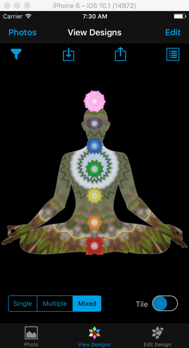
3.1.3 Mixed Mode
The mixed mode is selected by touching the "Mixed" button in the segment control. The mixed mode has designs which use multiple design objects. In mixed mode the user can only swipe vertically to change the designs. If the user swipes up or down the previous or next design in the mixed mode is displayed from the current design filter.
 |
|
 |
| Fig 3.5 - Mixed Mode - Swipe up or down to change the Design | ||
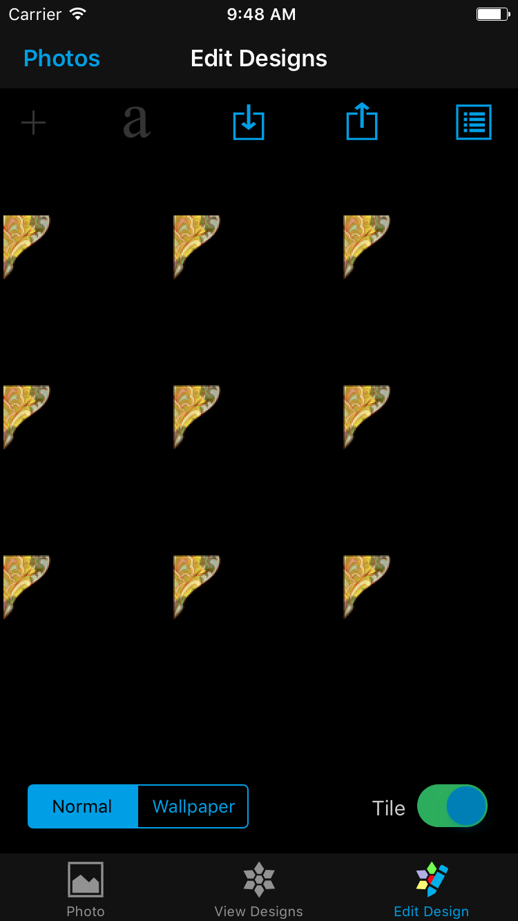
3.2 Design Tiling
To the right of the design modes segment control is the "Tile" switch control. The default is “OFF”.
When the user toggles the “Tile” switch to “ON” the existing design in the view is replaced by a 3x3 image matrix of the same design. The default tile size is 3x3 but can be changed to a different size from the Design Preferences view.
|
|
|
| Fig 3.6 - Tile - Create a 3x3 tile matrix of the Design image | |


3.3 Filter Selection
On the top of the view is a tool bar with four buttons. The first button is “Filter” button.
When the user touches the “Filter” button, the list of “Design Filters” is shown in the Design Filters view towards the bottom. The user can pan left and right to view the available filters. When the user touches a particular filter, that filter is loaded up and the first design object is shown in the “Single Mode”. In the following figure, the “Chakra” filter is the current filter and the user has changed it to “Skulls & Bones” filter.
|
|
|
| Fig 3.7 - Design Filter Selection - Design Filter changed to "Skulls & Bones" | |

3.4 Save Design
The second button, to the right of the filter button is the “Save”button.

When the user touches the “Save” button, the design is saved in the camera roll as well as in the “MonUnique” album. The image is saved in the default "PNG" format. The user can view the saved design either from the app by going to “Photo Selection” view or come out of the app and view it from iPhone Photos. By default a watermark is displayed at the bottom left. The watermark can be disabled from the App settings
 |
 |
 |
| Fig 3.8 - Save Design | ||
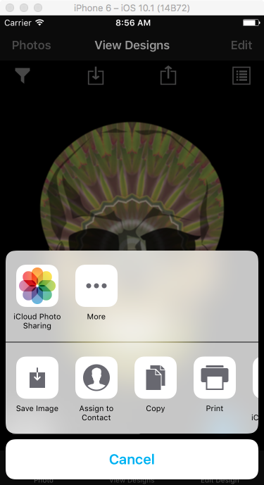
3.5 Share Design
The third button in the toolbar is the “Share” button.

When the user touches the Share button, the sharing framework of iOS is invoked and a user can share the design via email, messaging or other social platforms like Facebook, Instagram, Pinterest etc.
 |
| Fig 3.9 - Share Design |
3.6 Design Preferences
The fourth button in the toolbar is the “Preferences” button.

When the user touches the “Preferences” button the “Preferences” view is displayed. The user has the ability to change the Design background color. The background color of a design is transparent by default but can be changed to a solid, semi-transparent or transparent color by choosing a color from the Color Picker view. The Tiling size can also be changed from the default of 3x3 matrix to any other combination less than or equal to the maximum of 4x4. The default image saving format is PNG but can be changed to JPEG. When the user touches the "Set Default Values" button all the preferences are set to the default values.
 |
|
| Fig 3.10 - Design Preferences | |

3.7 Pinch Zoom
You can use the Pinch Zoom gesture to zoom into or out of the image. While you’re zoomed in no other action can be performed in the view or toolbar. In zoom mode a zoom icon is displayed in the center of the Image. Only when the size comes back to the original value, the zoom icon is hidden and you can perform other actions on the view.

|
3.8 Watermark
By default the watermark will show towards the bottom left of the design when it is saved or shared. If the user does not want the watermark to show, the user can go to the monUnique Settings and toggle the watermark switch to “OFF” ( please refer Fig. 3.12)

|
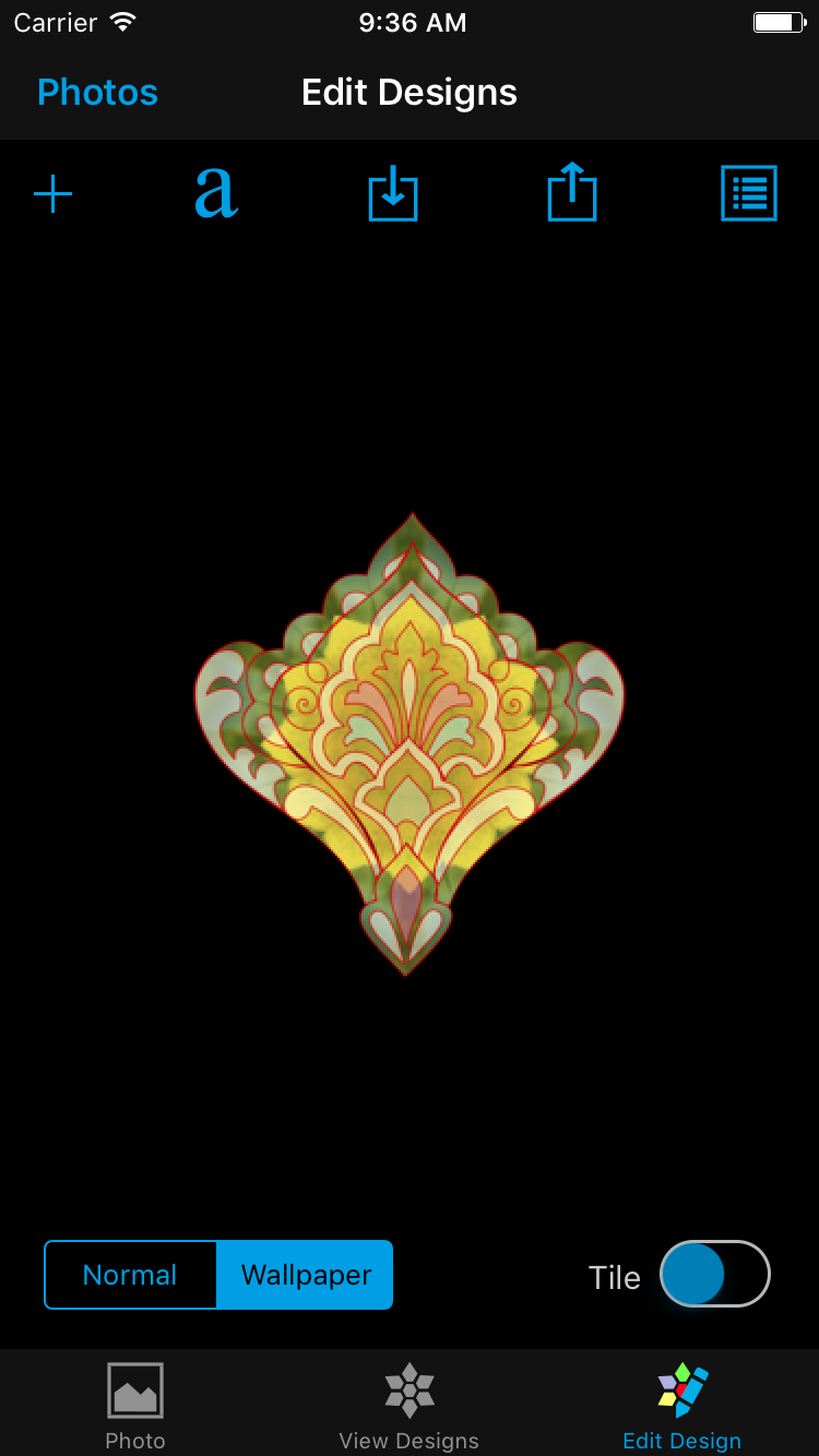
4.0 Edit Design Module
The Edit Design View allows you to change the design and design object properties. When the user is in the "View Designs" module and touches the "Edit Design" tab button, the user is transported to the "Edit Design" module. The design which was displayed in the "View Designs" will now be also displayed in the "Edit Design" view, the difference being in this view the user can edit the design. An alert might pop up asking you if the existing design should be cleared and replaced with the design in the “View Designs”. The user can enter the "Edit Design" module directly from the "Photo Selection" module also, in that case a blank design will displayed if coming for the first time.
 |
 |
| Fig 4.1: Edit Design - From Photo Selection | Fig 4.2: Edit Design - From View Designs |
4.1 Edit Design Object
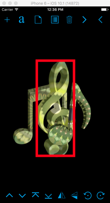
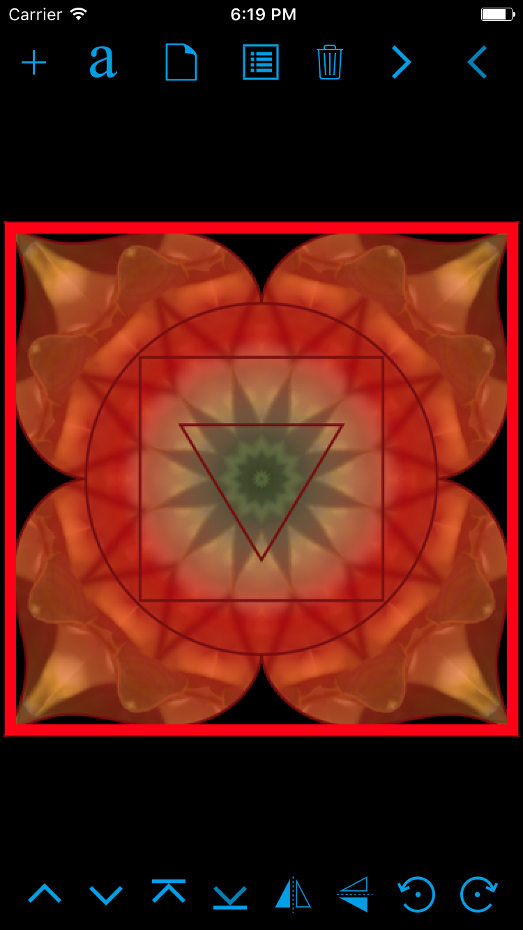
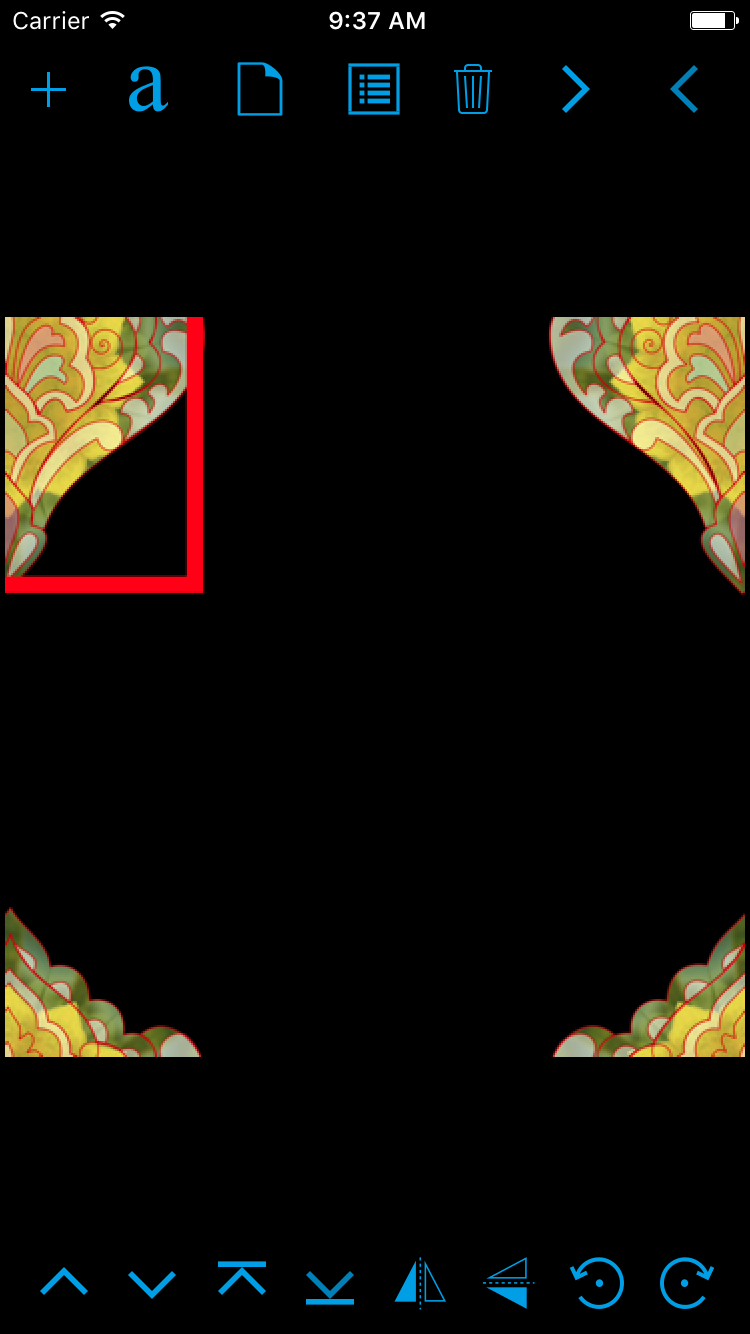
4.1.1 Design Object Selection
The user can select a design object by double touching it. Once selected, the design object is bordered by a red rectangle. The tab control, existing toolbars, and buttons are replaced by two new toolbars, one at the top and another at the bottom. Please refer to Fig. 4.3.
4.1.2 Design Object Resizing
The user can employ the pinch gesture with two fingers to resize the selected Design Object. The Design Object can not be resized beyond the minimum and maximum size as defined in the Design Filter. Please refer to Fig. 4.3.
4.1.3 Design Object Rotation
The user can employ the two fingers rotation gesture to rotate the selected design object. Additionally there are 2 rotation buttons in the bottom toolbar to increment in 1 degree angles: clockwise and anti-clockwise. Please refer to Fig. 4.3.


 |
 |
 |
| Fig 4.3 Design Object Selection, Resize and Rotation | ||
4.1.4 Design Object Translation
The user can use one finger Pan Gesture to translate or move the selected Design Object around the view as shown in the figure 4.4.
|
4.1.5 Flipping Design Object
There are 2 Flip buttons in the bottom toolbar.
-
When the Horizontal Flip button
is touched the Design Object is flipped horizontally.
-
When the Vertical Flip button
is touched the Design Object is flipped vertically.
 |
 |
 |
| Fig 4.5 Design Object Selection, Horizontal Flip and Vertical Flip | ||
4.1.5 Next/Previous Object
The two buttons towards the right of the top tool bar are used for navigation between Design Objects.
When the next 
When the previous 
 |
 |
 |
| Fig 4.6 Design Object Selection, Select Next Object and Select Previous Object | ||
4.1.6 Delete Object
When the user touches the delete 
4.1.7 New Design
When the user touches the new 

|
4.1.8 Order of Design Objects
The four buttons in the left of the bottom toolbar are used to change the order of the design objects, the order representing the order in which they are displayed front to back.
-
Send Back : When the user touches “Send Back”
button the selected Design Object is pushed behind the Design Object just below it in the order. Please refer to Fig. 4.8.
-
Bring Forward: When the user touches “Bring Forward”
button the selected Design Object is brought ahead of the Design Object just above it in the order. Please refer to Fig. 4.8.
-
Send to Bottom : When the user touches “Send to Bottom”
button the selected Design Object is pushed bottom most of the order behind all Design Objects. Please refer to Fig. 4.9.
-
Bring to Top: When the user touches “Bring Forward”
button the selected Design Object is brought to the top of the order above all the Design Objects. Please refer to Fig. 4.9
 |
 |
 |
| Fig 4.8 Design Object Selection, Bring Forward and Send Back | ||
 |
 |
| Fig 4.9: Send to Bottom and Bring to Top | |
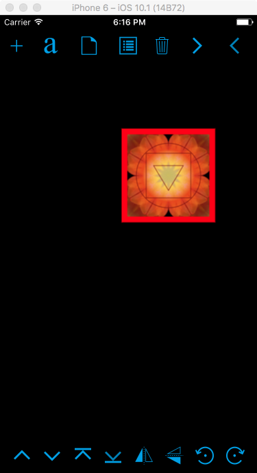
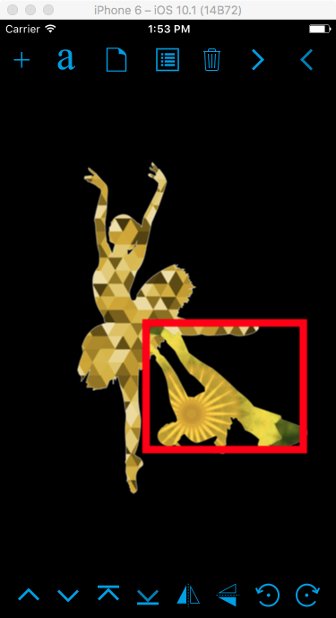
4.1.9 Design Texture
When a Design Object is selected a user can touch different parts of the view to pick a particular area of the photo to regenerate the texture as shown in the Fig 4.10.
 |
 |
| Fig 4.10: Select Design Object and Change Texture by Touch | |
4.2 Add Design Object
When the user touches the add 
 |
 |
| Fig 4.11: Select Design Object and Change Texture by Touch. | |
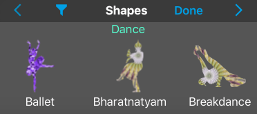
4.2.1 Filter Shape View
When the user touches the Add button, the Filter Shape View is displayed toward the bottom. The filter shape view has a toolbar on the top with four buttons and a horizontal scrolling pane. A user can pan left or right to view the available shapes/design objects in the filter. The name of the current filter is displayed and also the name of each of the shapes in the filter.
When the user touches the “Next” 
When the user touches the “Previous” 
When the user touches the “Filter” 
 |
 |
 |
| Fig 4.12 Filter Shape View. Next and Previous filter. | ||

|
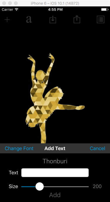
4.3 Add Text Object
When a user touches the “Text” 
 |
 |
 |
| Fig 4.14 Add Text Object | ||
4.4 Update Text Object
When a user “Long Presses” the Text Object the “Add Text” view is displayed. Here the user can update the text and or size of the font. Once the user touches the “Update” button the text object is updated as shown in the figure below ( the text “Ballet” is changed to “Dance” and size is changed to 100).
 |
 |
| Fig 4.15: Update Text Object | |
4.5 Design Object Preference
When the user touches the preferences 
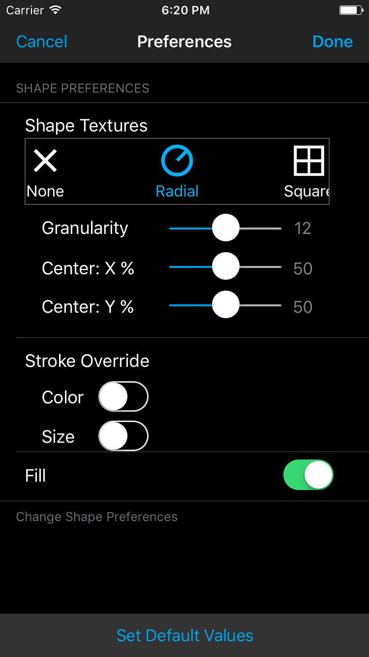
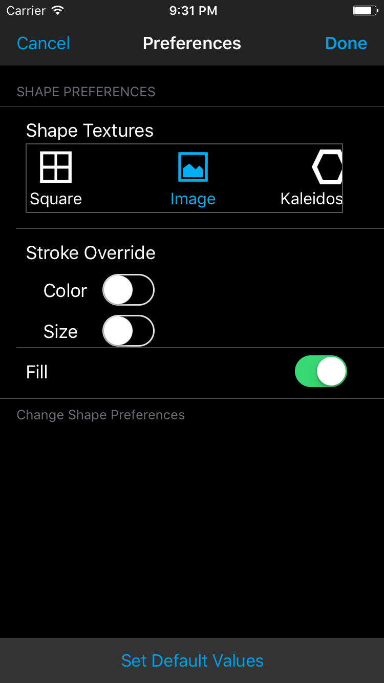
4.5.1 Texture Preferences
From the “Shape Preference” view the user has the ability to change the texture of the Design Object. The user can pan through the available Textures and when the user touches a “Texture” the texture options are displayed.
 |
 |
| Fig 4.16: Texture Preferences | |
4.5.1 Radial Texture
Fig. 4.16 shows the Design Object with a Radial Texture. The user has the ability to change the granularity of the Radial Texture. Also the radial center of the texture can also be changed by changing the Center X% and Center Y%. In the above figure the radial center of the texture and the shape is the same i.e at 50%, 50%.
4.5.2 Square Texture
The Square Texture has just one option to change the Granularity. Once the user touches the Done button the Design Object is changed to use the Square Texture as displayed in Fig. 4.17.
 |
 |
| Fig 4.17 - Square Texture | |
4.5.3 Image Texture
The image texture does not have any options will show a part of the image within the Design Object. The following figure, Fig. 4.18 shows the design object with Image.
 |
 |
| Fig 4.18: Image Texture | |
4.5.4 Kaleidoscope Texture
The Kaleidoscope Texture has just one option to change the Granularity. Once the user touches the Done button the Design Object is changed to use the Kaleidoscope Texture as displayed in the Fig. 4.19. The texture is similar to what is observed in a Kaleidoscope.
 |
 |
| Fig 4.19 - Kaleidoscope Texture | |
4.5.5 None Texture
When the user select the None Texture the Design object is displayed without any texture.
4.5.6 Color Texture
When the user selects the Color Texture and touches Done in the preference view, the Design Object is changed to be filled with the color as shown in Fig. 4.20. The color is picked from the region of the photo the user has touched. This texture has the option to override the color by using a fixed color rather than using a color from the photograph.
 |
 |
| Fig 4.20: Color Texture | |
4.5.7 Triangulation Texture
The Triangulation Texture has just one option to change the Granularity. Once the user touches the Done button the Design Object is changed to use the Triangulation Texture as displayed in the Fig. 4.21. The texture uses arrangement of triangles of different shades of the same color.
 |
 |
| Fig 4.21: Triangulation Texture | |
4.5.8 Stroke Override
The user can change both the Stroke Size and Color of the Design Object with this override. Fig. 4.22 shows the stroke color has been change to white and size has been increased to 5. When the user touches the color box the Color Picker view is shown.
 |
 |
| Fig 4.22: Stroke Override | |
4.5.9 Fill Switch
Some of the Design Objects have a Solid or Gradient Fill. If the user chooses to switch Fill to "OFF" the Design Object will be displayed without the fill. In the Fig. 4.23 the original Design Object had a red gradient fill which has not been used since the Fill switch is "OFF".
 |
 |
| Fig 4.23: Fill Override | |
4.6 Wallpaper Mode
In Wallpaper mode if a Design Object is moved towards the edge the missing parts are drawn on the other edges/sides. The second figure in Fig 4.24 shows a design object in Wallpaper mode. These are not 4 separate Design Object, but a single design object whose missing parts are drawn in the corresponding edges. When this design is tiled the missing parts will combine to form a complete Design Object giving the design the required continuity. Fig 4.25 shows the same Design Object in Normal Mode and is missing the continuity.
 |
 |
 |
| Fig 4.24 Wallpaper Mode and Tiling - Gives the Continuity to Design. | ||
 |
 |
| Fig 4.25: Normal Mode and Tiling - Continuity is missing | |
5.0 Gestures
The following table shows the list of selected Gestures in different views.
| View | Gesture | Touches | Action | Remarks |
|---|---|---|---|---|
| Photo Selection | Swipe Left | 1 finger |
Second Page of the view is displayed |
|
| Photo Selection | Swipe Right | 1 finger |
First Page of the view is displayed |
|
| View Design | Swipe Left | 1 finger | Next Shape in the design is shown | Not applicable in the Mixed mode |
| View Design | Swipe Right | 1 finger | Previous Shape in the design is shown | Not applicable in the Mixed mode |
| View Design | Swipe Down | 1 finger | Next Design in the Filter | Not applicable in the Single Mode |
| View Design | Swipe Up | 1 finger | Previous Design in the Filter | Not applicable in the Single Mode |
| View Design | Single Tap | 1 finger | Texture is changed in the Design Objects based on the position of touch on the photograph. | |
| View Design | Single Tap | 2 fingers | The position of the image within the design object is changed | This is applicable when image texture is used or there is an overlay image in the design object. In future Pan Gesture will be used. |
| View Design | Pinch Zoom | 2 fingers | Supports zooming in and out of Design. | Zoom icon is shown when zoomed in. |
| Edit Design | Double Tap | 1 finger | Design Object is selected or deselected. | Red border surrounds the selected object. |
| Edit Design | Single Tap | 1 finger | Texture is changed in the Design Objects based on the position of touch on the photograph. | |
| Edit Design | Single Tap | 2 fingers | The position of the image within the design object is changed | This is applicable when image texture is used or there is an overlay image in the design object. In future Pan Gesture will be used. |
| Edit Design | Pinch Zoom | 2 fingers | Supports zooming in and out of the Design when no objects are selected. | Zoom icon is shown when zoomed in. |
| Edit Design | Pinch Zoom | 2 fingers | Resizes the selected Design Object | |
| Edit Design | Pan | 1 finger | Moves the Design Object around | |
| Edit Design | Rotate | 2 fingers | Rotates the Design Object. |